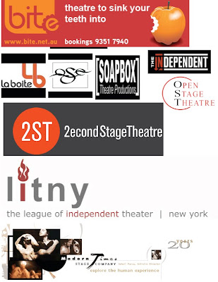
That being said, we need to take a bit more time to evaluate our logo design. This isn't throwing out the baby with the bath water, but it is taking the information received and crafting a logo that speaks of theatre better than what we have crafted.
We have learned a lot about logos in general, specifically the need for usability and sustainability across all platforms. The simplicity is crucial for our logo, but we need to evaluate the *effective* branding of other companies in the arts, most notably theatres, to combine some general communicative ideas.
You are to research 4-5 different, effective brands of theatres and/or companies involved in the arts, provide their logos as inspiration, and create 1-2 new logo designs, vector-based, ready and clean to be used as is.
Spend time on this, don't provide rudimentary ideas, and we will make a final decision first thing tuesday, on the best implementation of what we have. Call me or email me with any questions or concerns. I know this sucks, I know we have other things going on, but this is the foundation of our project and the success or failure of the brand and the needs of the client depend on the effectiveness of our logo.
Initial research suggests that perhaps a logotype, or at least a better blend of vector and typography may be one way to go, although the possibilities are truly endless. Good luck.

So after looking at the logos you posted here and what I have chosen to draw ideas from in your opinion and your knowledge of Rob do you feel he was looking for a more geometric / structured / slight corporate approach or something along the lines of a organic highly stylized design?
ReplyDelete